Posts

Final Website Design
Image
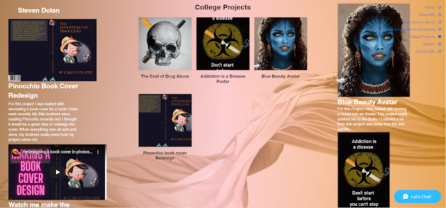
 Final Website Design For my final design, I put my heart and soul into it! I have the navigation device that follows the user as they move down the page. I have put my work from throughout the years onto this website. That includes, high school, college, and any other time I made art. I put in transitions for every bit of showcased works above the gallery. The gallery displays all the artwork on the page in one convenient section and you are able to zoom in by clicking the image. I put a lot of effort into this website and I hope you enjoy. Wix website link: https://cjtriumphs1.wixsite.com/adphotoshopillustra Website: College Section

M6 CP - Home Page and Navigation System, Final Project (Part 1)

Image
  M6 CP - Home Page and Navigation System, Final Project (Part 1) For this assignment I tried to make unique arrangements for my Homepage and sorts of navigation systems. I always did like the idea where all the important buttons follow you as you go down the page, just a very quality of life option for potential clients and this extra bit of care put into a website can decide whether or not people would want to commission you. I have made some detailed sketching's trying to come up with a design and I hope everyone enjoys what I came up with.

M5 CP - Avatar or Photo Retouching (Part 2)

Image
  M5 CP - Avatar or Photo Retouching (Part 2) Avatar  For this Assignment I chose to go the avatar route. I have been fascinated with the idea that someone can so easily change the appearance of a person to look different or Alien. To make this I had to first find a model. I searched up beautiful faces high resolution and I managed to find a great model. The picture was called "Black Beauty," and what a beauty indeed. She was the perfect model for this assignment. In this assignment I got to use the tool that has always had my back in every assignment I posted thus far, layer mask. I  used a lot of layer masks to cover up mistakes and areas I messed up in and for steps of the projects itself, it was truly amazing. To give it that nice blue skin color I had to paint over her face and blend it in with her skin. I used the layer mask to remove the color from the eyes. I tried to make any highlights stand out on her face. Next I  focused my efforts on the eyes and made them bigge

M5 CP - Avatar or Photo Retouching (Part 1)

Image
  M5 CP - Avatar or Photo Retouching (Part 1) With this project I want to try and make a cool looking avatar. unfortunately I just found out the picture I used for the first sketch on the left is unable to be downloaded as it is protected by some kind of licensing on the website. I will make the cool looking blue skin or try something different. I could try and make some cool markings and whatever else might seem cool. High resolution is my goal. 

M4 CP - Book Cover Design (Part 2)

Image
  M4 CP - Book Cover Design (Part 2) Pinocchio Cover I love Pinocchio and this book is just such a classic. I thought it would be fun to redesign the cover since my little brother was reading the book for school. On the cover we have Pinocchio and everyone's favorite cricket, Jiminy Cricket. I took a used a Pinocchio picture I found on the web and layer masked it so only the cricket and Pinocchio was visible. I had also adjusted the hue and saturation on the image to give a nicer, cleaner look to it. I also chose the Trajan Color font to make the cover feel more authentic. On the spine I have a picture of Pinocchio's head which I got from the front and just finished layer masking. I also kept the same font for the text and I have the Walt Disney logo to make it feel like it's a real book cover. Now I admit the back does seem kind of bare. I used the rectangle tool to make a box for the text to go into which has the same font. I then have the price of the book and the barcod

M4 CP - Book Cover Design (Part 1)

Image
  M4 CP - Book Cover Design (Part 1) Book Choice For this project I decided to redesign the Pinocchio cover. I looked at some images from Pinocchio to see what it had to offer. Through this dive into Pinocchio I have developed a few covers from the images I gathered.  The first front cover is a picture of the Walt Disney's Pinocchio's head which will be blended into the background. The Spine also has a picture of Pinocchio as well as the logo for the book I had used for reference. on the back is just the text with a bar code and the cost. The second front is a picture of famous Jiminy Cricket which will also be blended into the background. The front also has a picture of a log to represent Pinocchio. The Spine has a picture of Jiminy hat with the title, logo, and author. The back has the text and a log like on the front. It also has the barcode and cost. The third front has a picture of a puppet on it to represent Pinocchio which will be faded into the background. On the Spine

M3 CP - Awareness Poster (Part 2) Drugs, the People Killer

Image
  M3 CP - Awareness Poster (Part 2) "Drugs, the People Killer" For this awareness poster I wanted to make it nice and simple for people to understand. Everyone knows the bio hazard symbol and if you see one of those suckers, you best stay away. To link the symbol to drugs I put a smoking cigarette through the symbol so the reader understands the connection. I also made the background black and the font white so it would stand out more, really make it pop. Abusing drugs is never good for anyone and you don't even need to be the one abusing drugs to be affected. Many people die every year from drug overdoses and I think that it was really important to make this issue crystal clear.                                                     Here are the images I used.